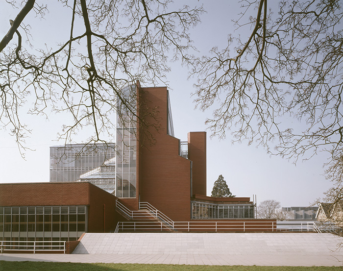
Sir James Stirlings’ (1924-92) fondness of colour is an important architectural characteristic across his lifetime’s work; from his early student work, which shows the use of clashing primary colours, to his breakthrough projects, the Red Trilogy, and the bold colours in his later postmodern buildings.
Stirling himself was renowned for his colourful, larger-than-life persona, which was expressed through his attire and included his signature purple socks and a deep blue shirt. His wife, Lady Mary Stirling, expressed perhaps jestingly a belief that her husband, whose name later became synonymous with the most prestigious architecture prize awarded by the RIBA, might have suffered from colour-blindness.
The gaudy presence of Stirling did not go unnoticed. In the mid-1980s, the German-American architect Ludwig Mies van der Rohe (1886-1969) and James Stirling would become entangled in a three decade-long architectural battle when Lord Peter Palumbo commissioned Stirling to build a modern masterpiece in the City of London, replacing the unbuilt, posthumous Mansion House Square scheme designed by Mies. It was an unusual pairing: it was Britain’s most notorious postmodern protagonist following the tracks of one of the pioneers of the modern movement, the master of a restrained and muted architectural language.
Yet, even before this happenstance their respective approach to colour made a contrasting encounter. Dirk Lohan, grandson of Mies and later project architect on Mies’s Mansion House Square, recalls his first meeting with a young Stirling in the late 1960s. Upon his grandfather’s request, Lohan took Stirling to see Farnsworth House in Mies’s car - a white Lincoln Convertible with four doors and black leather seats and interiors. Apart from very friendly conversation, Lohan remembers how Stirling appeared in a dark suit with open shirt collar and bright, primary colour socks. They were very noticeable; they had red, yellow and blue in them and Lohan will never forget how bright these colours radiated in the slick black interior.
Stirling’s use of cheerful colours did not always generate a convivial atmosphere. They could also cause controversy. A dispute with Tate curators over the wall colours for the Turner paintings in the Clore Gallery extension resulted in a prolonged ‘colour war’ as recorded in the biography Big Jim by Mark Girouard. Another extension, the School of Architecture at Rice University, had their wall colours repainted in a more modest tone of grey shortly after completion.
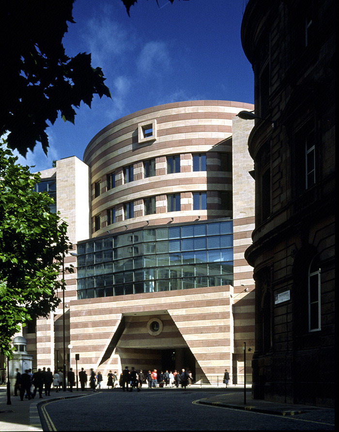
The way in which Stirling employed colour in Number One Poultry, his only major London commission and the successor project of Mansion House Square, expresses a similar playfulness to his string of cultural and university commissions in the 1980s. Yet, the material choices and colour palette also pay respect to the conservation area around Bank Junction in the City of London, as well as employing an eclectic and creative play with historical references. The façade of Number One Poultry is characterised by its alternating bands of muted yellow and salmon-pink sandstone, creating a distinctive reference to the colour combination of the architecture of Gothic Revival architect William Butterfield (1814-1900) and bronze windows in reference to Edwin Lutyens’ (1869-1944) Midland Bank.
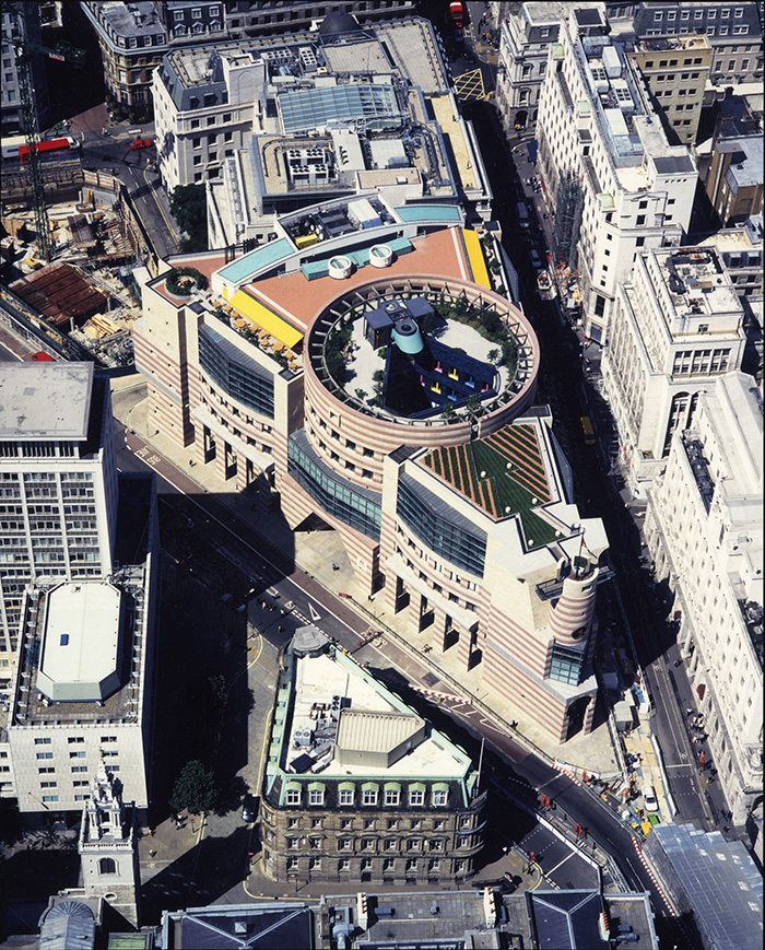
Tucked away from immediate street view, the building exudes a much more daring use of colour with opposing yellows, greens, pinks and blues to express manufactured materials in contrast to the softer colours of natural stone. The most striking use of colour of the five-storey office building is kept for the rooftop terrace and internal courtyard, providing visitors with continuous visual surprises.
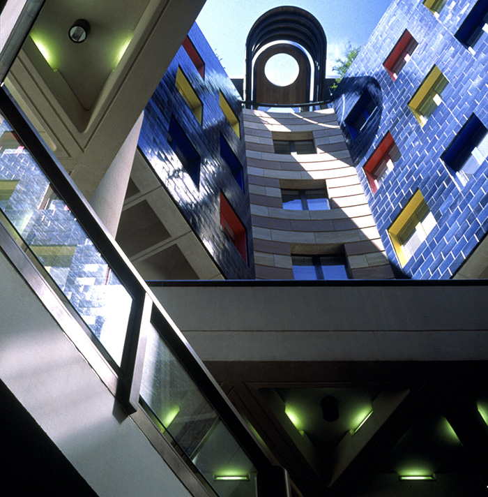
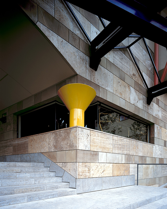
But Stirling did not only take colour inspiration from the past. He also readapted elements from his past projects. On the rear elevation of Number One Poultry a single, squat column in bright yellow is almost identical to an architectural support column featured in the widely acclaimed Neue Staatsgalerie Stuttgart, allowing us to trace Stirling’s fascination with certain colours and forms through their repeated use across isolated projects in different countries and different contexts.
Stirling's No. 1 Poultry is examined alongside Mies's original scheme for the City of London site in the free exhibition: Mies van der Rohe and James Stirling: Circling the Square, until 25 June 2017
